Sunday, April 10, 2011

catherine kehoe lecture

Attending the Catherine Kehoe lecture was a beneficial experience for me, because it obliged me to consider my own ideas and biases in regards to art and making. Kehoe is a visual artist with whom I feel I share very little in common. During the lecture, Kehoe spoke poetically and figuratively about her love of observational painting. I realized then that I had - in all truthfulness - forgotten that this kind of art still exists.

Before I came to art school and before I had any understanding of contemporary art whatsoever, I considered myself a painter. It didn’t take long for me to realize that as a medium, it wasn’t for me. It wasn’t that I wasn’t “good” at it. It simply occurred to me that no matter how much time I devoted to painting, I could never do anything new. Painting is a medium in which virtually every avenue has been explored, and Kehoe acknowledged this in her lecture. Kehoe, however, sees no issue in this.

I admired Kehoe’s honesty in these regards, and realized that she is an artist who revels in the act of making, above all else. I feel that this love of making objects by hand is a relatively rare quality among contemporary artists. One might argue that most contemporary art has less to do with process and more to do with concept. In my own work, I consider the process of making as the means to convey a concept - which is ultimately more important than the process itself. For Kehoe, perhaps it is the opposite?


Kehoe’s paintings act as visual records of private conversations between artist and medium. This process works for her, but it is a formula I have always found to be lacking in certain respects. I believe in art that performs a social function, and causes the audience to consider a new idea or challenge their own (mis)conceptions. The only possible social function I can gather from this work - besides Kehoe’s own personal relationship to it - is that of spirituality.

I think paintings have the power to move people; perhaps more so than any other form of visual media. It’s the sort of power I can respect, but with which I certainly cannot identify. I believe that with painting comes a certain level of vanity, which rarely captures my interest when viewing a piece of art. Kehoe painted a series of portraits of deceased family members, using low-resolution JPEG images as source material. During the lecture, I was reminded of something Steve Locke once said about making art about ones’ family. It was something along the lines of, “If you’re going to make work about your family, your family had better be interesting; and - if they are not interesting – you’d better somehow make them interesting.” I tend to agree with this sentiment, and feel that I have seen far too much work in coherence to the latter form – which is more challenging, I think. Kehoe’s series was no exception, because no matter how skillfully these nameless, dead Hungarians were painted, I still felt no relation to them as a viewer.

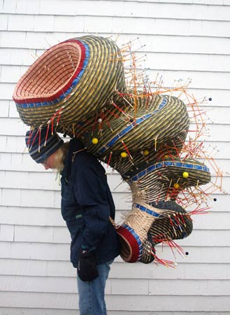
I realized that if we were to put the artists Catherine Kehoe and Nathalie Miebach on a spectrum, they would be polar opposites. Miebach seemed fiercely defiant about acknowledging any sort of emotional connection to her work, perhaps for fear of sounding frivolous? On the contrary, it is Kehoe’s personal connection to her work that makes it interesting. When an audience member questioned Kehoe’s reasoning for working in such a small format, her answer was ambiguous: “Because I enjoy it, is that reason enough?” In the end, I think that both processes are flawed. I enjoy making and viewing artwork in which the concepts are clearly defined, but there remains room for ambiguity. If either of these components is missing, we have to question why the artwork was made at all. Total observation hours: seven.


Catherine Kehoe


Nathalie Miebach

new work / deCordova

Moving right along… I’ve started working on a new project. Conceptually, this work is more along the lines of “exploring relationships” between myself and the things I buy. I recently bought a somewhat pricey pair of running shoes from Adidas.com. The shoes came in some of my favorite colors, as you can see here. All things considered, I was fairly happy with my purchase. I say fairly, because even though I had ordered the shoes in my usual size of 8.5, they were undeniably too big for my feet. I considered exchanging the shoes; I emailed customerservice@shopadidas.com to inquire about this. They replied immediately with an automated response:

Dear Valued Customer,

Thank you for contacting Customer Service at www.shopadidas.com.

Your questions and concerns are important to us and we are dedicated to assisting you in anyway possible. In order to assist you in the most efficient and timely manner, all email correspondence must be submitted through our online email form. To locate our online email form, we ask that you visit our Help Desk at Customer Service at www.shopadidas.com/helpdesk and choose Contact Us under Online Store Information. Then, choose the subject that will address your question and send us an email through our online email form.

We apologize for any inconvenience this may cause you.

Sincerely,

Customer Service at www.shopadidas.com

… Just to give you a sense of how much of an inconvenience it is to exchange shoes: After going through a maze of “help desks” and “online email forms”, I found that the only possible way for me to exchange my shoes would be to return them via UPS (i.e. pay for shipping). Adidas estimated it would take 14 days for my refund to be disbursed after the shoes arrived back at their warehouse (almost a month after they first arrived at my doorstep). From there, I could re-order the shoes in a size 8, but I would have to pay shipping fees this time around because the “free shipping on first order coupon” was a one-time offer. I would be out and extra $20, and I would be sneaker-less for a month. In the end I decided to keep the shoes that are just a tad small for my feet, and live with the remorse. “If I had only bought them in a size 8, they would be perfect.”

For my next piece, I plan on exploring the idea of “buyer’s remorse”. I’ve been reading about the effects of buyer’s remorse on the human psyche in a book called The Paradox of Choice: Why More is Less by Barry Schwartz, an American psychologist and professor of social theory and social action at Swarthmore College. In this book, Schwartz speaks about the multitude of choices we face everyday as consumers. He argues that even though we, as American consumers, may believe that more choices in the supermarket can make us happier (or, “more free”), the opposite can actually occur. We live in a society that offers millions of choices – from what brand of cereal to buy, to what majors/minors/concentrations to study in college, to what running shoes to purchase off of the Adidas website and in which colors. People tend to think that having more choices is the key to happiness and freedom; it’s only logical – the more options that present themselves the more likely we are to select the best one. Schwartz goes on to explain that this is not the case at all, from a psychological standpoint. When so many options are available, it is easy to become overwhelmed. Americans spend more time shopping than any other people in the world for precisely these reasons, and it certainly does not make us any happier. Even when we finally make those big decisions – what cereal to buy, what major to study in college, what shoes to buy off of the Adidas website – we find that we are less satisfied because we must live with the nagging question, “Could I have made a better choice?”

Anyway, this is why I will be re-creating my pair of Adidas shoes out of fabric and tailoring the reproductions so that they will fit my feet exactly. I see this project as an exercise in coping with the loss of buying shoes that don’t fit me. I am looking to the artist, Rachel Whiteread, because I feel like there is something to be said about exploring the negative space of objects (in this case, the negative space is the half inch of space I feel in the toes of my Adidas sneakers, representing a sense of personal loss).


Rachel Whiteread


This is a photo I took in the studio, to document the process of creating a sewing pattern for shoes. I molded muslin to fit the contours of my feet exactly, simply by the process of wrapping and pinning. From there I can cut and trace the pattern pieces onto more muslin, and finally onto a cotton/synthetic mix fabric that will be my final piece.

Finally, I went to the deCordova museum recently. I saw Rachel Perry Welty’s exhibit, and I loved it. The pieces that stand out in my mind are the collages she made using magazine cutouts of letters to form the lyrics of songs she knows from grocery store music playlists. The piece is about the ubiquity of “grocery store songs”. In a way it reminded me of my handmade barcodes. I thought the piece where she color-coded her son’s hospital bills was really moving – the thought of injecting color into these obviously deeply insensitive and hurtful documents brought out the humanness of them. I think that in many ways Rachel Perry Welty is doing what I am starting to do in my work. Total observation hours: six.

Rachel Perry Welty

critique notes

“One finished drawing is presented to the critique. The drawing is drawn on off-white, heavy weight drawing paper. There are a series of lines of varying thickness drawn in a vertical wavy motion. Each one of these lines correlates with a series of numbers that run horizontally along the bottom of a square composition. Some of the lines are painted in earth tones and pink with a water-based medium.”

This is mostly true, except I did not use any sort of water-based medium. The drawing is done completely in pencil – graphite and colored pencils.

“The content of the drawing is ambiguous. It resembles a landscape, an abstract grouping of trees, or an image of sediment or sand under a microscope, one individual even suggests a resemblance to a textile pattern. The varying widths of line create an attractive wavy motion on the paper. Seeing the artist’s hand in the making of the lines lends to the organic quality of the drawing. Does the artist want the viewer to express his or her own interpretation on the art? Is the line and the type of line the appropriate vehicle for representing the artist’s concept? At first I don’t notice the numbers along the bottom of the composition until another individual comments on them. Are the numbers meant to be part of the art? Do the numbers represent something in particular or are they just reference points for the artist? What happens to the piece if the numbers are not visible? The lines themselves capture the viewer’s attention and hold the space on the paper.”

Yes, the drawing is ambiguous. This much is intentional. Someone said the drawing reminded him of a textile pattern, which I found interesting because so much of the process of creating this drawing reminded me of weaving (particularly string tensions on a loom). To answer your question, yes, I would always want the viewers to express their own interpretation of the art. I see no point in creating art that is so concrete it leaves no room for interpretation.

Is the line the appropriate vehicle for representing my concept? Well, my concept was - simply put - to make barcodes by hand. I guess the real question here is am I finding what I’m searching for by making these lines? To answer that question, I think I would have to make more of these drawings. I see this work as an exercise in which I am developing a drawing formula.

The numbers are a part of the piece because I was copying barcodes, but they could easily be taken away. I think having them there is what made people think “this is a barcode”, but then again I can’t be sure because I didn’t really get to hear people’s thoughts before I found myself explaining my reasoning. The numbers did act as reference points as I was drawing, because I could see that if I stopped at the number 7, for example, I would simply resume drawing at the number 7. I think that if the numbers were not visible, people would not read the drawings as barcodes unless I titled them “Barcodes I: Items from the Studio”, etc. On the other hand, if the numbers were not visible perhaps it would deter people from thinking that I was trying to accurately represent a barcode. I wasn’t. I was trying to find humanness in the barcode. So, yes, I could get rid of the numbers.

“Upon further reflection of the artist’s comments during the critique and in the artists statement, the drawing is meant to be a representation of a bar code and an attempt to catalogue the artists relationship to certain purchased objects. At this point in the artists investigation the relationship between the drawing and concept does not appear cohesive or not yet resolved. Visually it is difficult to derive barcode or link the lines to anything other than an aesthetic exploration of space. Is the exploration of this specific concept still in the early investigative stages?”

Well, I was using barcodes as source material but not in the hopes that I would re-create the barcode. My intentions were not to realistically draw a barcode – if they were I would have used different tools. The point is that I did it by hand, and that my hand is still evident in the final piece.

I don’t know if I would say this piece is about cataloguing a relationship as much as other pieces of mine. I think if I said this during the critique, it was simply because I was not “in the moment” and seriously considering the significance of this work to me. I see this piece as a departure from this concept, in some respects. I think here I was trying to find humanness in the barcode. My concept wasn’t cohesive or resolved when I started drawing – if it was, what would be the point? I want to make more of these drawings. Yes, I am in the early investigative stages of this concept but in no way do I see this work as an aesthetic exploration of space. I think the colors are what might make someone think this, but I do not see this work as decorative.

“At the end of the critique the artist asked if she should create more of these drawings. Creating a series of these drawing would make an interesting series. Consider more vigorous investigation of how line and mark making can be used as a tool for recording, and how the act of recording can be a means of visual expression. Also consider the process of line application and scale.”

I intend to make more of these drawings. Dana suggested that since I did a piece using barcodes from items in my studio, I might make other drawings of barcodes from objects I find in other spaces in my life (bathroom, bedroom, kitchen, etc.). I can see some real potential in this.

I feel like the drawing process I’ve created for myself is similar to weaving. I do believe the act of recording can be a means of visual expression, and those are my intentions with this piece. These lines record my hand’s motion, which is invariably affected by muscle tension. In weaving, “tension” refers to how tightly the strings of the warp are pulled through the heddles of a loom – the tension must be perfect. The scale is such because the paper is about arm’s length, and physically as large as I could comfortably pull my arm from top to bottom.


“Artist Suggestions:
Sol Lewitt
Tim Bevington
Brice Marden
Danica Phelps – If there is an artist that I feel best represents what you are trying to accomplish, I believe that Danica Phelps would be that artist. She uses color and a method of mark making to record every day occurrences. The best example that comes to mind is a drawing made up of a method that she invented to record how she spent money earned from a home refinance (for example fun, home repair, food etc.) Look up her drawings. She has lately been doing sculptures but her drawings are more interesting conceptually.
http://www.danicaphelps.com/”


I was definitely thinking about Sol Lewitt while making this piece. In this piece I was developing a drawing formula that could be reproduced. I feel like there is a sense of irony in drawing a barcode, because barcodes are supposed to be “readable” to scanners. The imperfection of the hand-drawn line would not register.

As for all the others, I have to keep searching. I’m having trouble finding anything salient – all the images I’ve found are low quality and their websites don’t even contain artist statements. What, specifically, about these artists do you think would interest me? I feel like there are millions of people that have painted lines in the history of painting. I am not a painter, however, so where then do I fall on the spectrum of minimalism?

If I’m supposed to create a “family of artists”, this is it: Sol Lewitt is my dead grandpa, Yayoi Kusama is my eccentric, living grandma, Guy Ben-Ner is my cool uncle, Rachel Perry Welty is my soccer mom, Gabriel Kuri is my overachieving brother, and Chris Johanson is my next door neighbor.

Sol Lewitt

Yayoi Kusama

Guy Ben-Ner

Rachel Perry Welty

Gabriel Kuri

Chris Johanson

Saturday, March 12, 2011

nathalie miebach lecture

I was glad to have attended the Nathalie Miebach lecture last Thursday, if only to be reminded of the importance of remaining objective in the face of creating a body of work. I remember seeing Miebach’s work in the Godine gallery last year, and being intrigued by the concept of weather statistics informing design decisions. During the lecture, I was most struck by Miebach’s collaborative, music-based projects dealing with similar concepts. The audio she shared titled, “Hurricane Noel” was chilling. I found her comment on the powerful nature of music to be valid. I believe she said, “I’ve found that it is so easy to move people through music, and so hard to do this through sculpture.” This idea stuck with me throughout the rest of the lecture, and I found myself trying to imagine what her baskets would sound like if they were translated to a musical score.

I am interested in the idea of using musical tablature as a drawing medium. I’ve seen other artists do this, Louis Bourgeois, for one. I feel like adding the collaborative element of music-making must have required a lot of courage from Miebach, who seems very much involved in her processes to the point that perhaps she’s a little out of touch with her audience. She alludes to the notion of “performance” when she talks about her work, referring to her installation space in the American Craft museum as being “theatrical”. She said her intentions were to make work to make the viewer feel like an actor on a stage, but I don’t know if this was achieved? I suppose I just had to have been there. I’ll take her word for it?

When I consider my own work in relation to that of Miebach’s I can see some similarities. We both make conceptual work, anyway. Miebach kept saying that every design element of her baskets was symbolic for something - every angle, every color, every bead. Everything was intentional, and nothing was decorative. At first I was totally on board with her when she said this: yes, here is contemporary art that is visually striking but conceptually driven – she came up with a working formula! She’s done what I strive to do! But then, after she mentioned this a few more times, I began to wonder: why isn’t there a decorative element? Where is the ambiguity? I mean, it’s there for the viewer upon seeing it: what is it I’m looking at? Why this shape? What is this thing’s function? But, after hearing Miebach talk about the work, I was a little sobered. She seemed to have an answer for everything, which made me wonder, what drives her to continue making this work? I feel like after a certain point, it would get boring! If it were my place to advise her, I would suggest to her to continue exploring the element of “play” she alluded to when she briefly spoke about childhood, and toys. I feel like this would be rewarding for her, as an artist, to maintain objectivity but not to the point where the work loses ambiguity.

Thursday, March 3rd. Observation Hours: 4.

ICA, mark bradford and gabriel kuri (nobody needs to know the price of your saab)


I enjoyed Bradford’s work in video more than his collages. Maybe I’m just too lazy to “read” a collage. I spent more time reading the labels on each of his pieces than I did looking at the pieces themselves. I was more interested in the “what” (materials) than the “how” (technique/skill involved). I went to the ICA with my mother, who was visiting from out of town. This is always a great experience, seeing contemporary art with my mother who knows nothing about it. Maybe I didn’t care that much about the collages because my mother loved them. She said they were, “beautiful”. I’m wary of any art my mom can declare “beautiful.” The videos were readable to me. I guess I just understand the language of video better than that of painting or collage.
Gabriel Kuri is my new love. The title of the show itself grabbed my attention, and the work did not let me down. Kuri is an artist working in Mexico City who holds on to every receipt of every purchase he makes, ever. I, too, do this - although, I never thought to incorporate it into my art. Kuri makes sculptures using receipts. He makes fiberglass sculptures of greasy food he once ate and has the receipt to document. He has woven tapestries of the receipts of expensive, life-changing purchases. I make drawings of bar codes and cheap furniture. Kuri’s work speaks to me on many levels.

Monday, February 21st. Observation Hours: 3.

gallery-going


On Thursday evening, I stuck around for the openings of three new shows in the Arnheim, Bakalar and Paine galleries. They were, respectively, For Emily, Astatic, and Inside the Painter’s Studio.
The first of which, For Emily, struck me for the artist's use of hair as a drawing material. The work was very personal, and very tragic. The artist invited us into something that was obviously very dear to her and very painful, and it was done delicately and with tact. It was a very respectful exhibition.
The second show, Astatic, struck me for it’s melding of animation with installation - which drew me into the work a lot more than some gallery animation shows I’ve seen. I once went to see an animation show at Harvard, and you could tell that the curators had a hard time trying to make it interesting/appealing to the audience, in these respects. I think the decision to include physical objects in the gallery changed the space entirely, and that having that additional dimension made the entire exhibit function better as a whole.
The last one was a cool; I’ll give it that. Inside the Painter’s Studio left me wishing that Fig would recreate the studios of other kinds of artists - artists working in a wide range of media, for example. I feel like that would be more interesting for me to see, personally. The concept of documenting the artist’s experience in making art is very interesting to me, and something I might explore in my next series. In many ways it was like a small-scale open studios, in an imagined space where all these artists were linked together. Very cool stuff.

Thursday, February 10th. Observation Hours: 1.